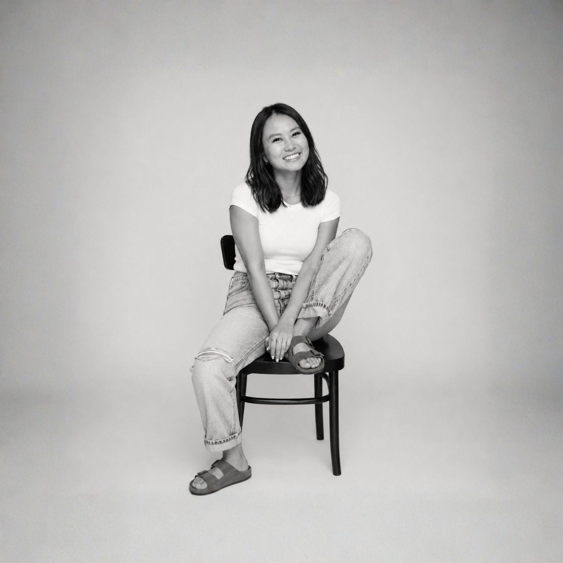
I'm Cindy Nguyen, a UX designer who started in biology and ended up here, which honestly makes a lot of sense. I'm drawn to systems, to the logic underneath things, and to making something complex feel like it was always simple. I work in fintech and operations, and I bring a visual-forward perspective to a space that usually leads with function over form.
Visual-forwardFintechInteraction design
Recent work
Photography
Seeing slowly in a fast world.
It started as a creative outlet and quietly became a practice that sharpens how I see — the light, the composition, the weight of a place. It makes me a more patient designer, even when I'm not thinking about design at all.
People in placePortraitsMoments
LiftZermatt, CH
Be bouldJoshua Tree
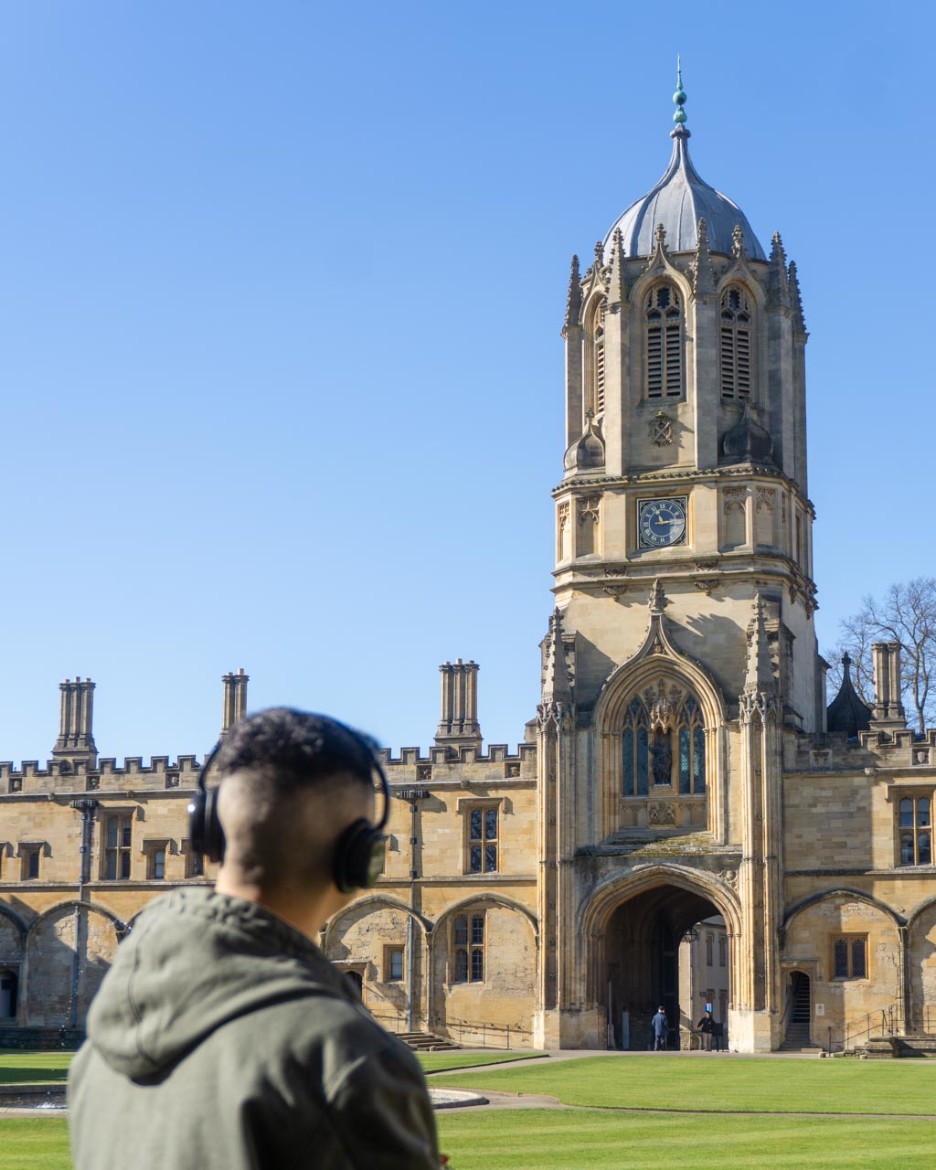
Christ ChurchOxford, UK
UnwindKyoto, JP
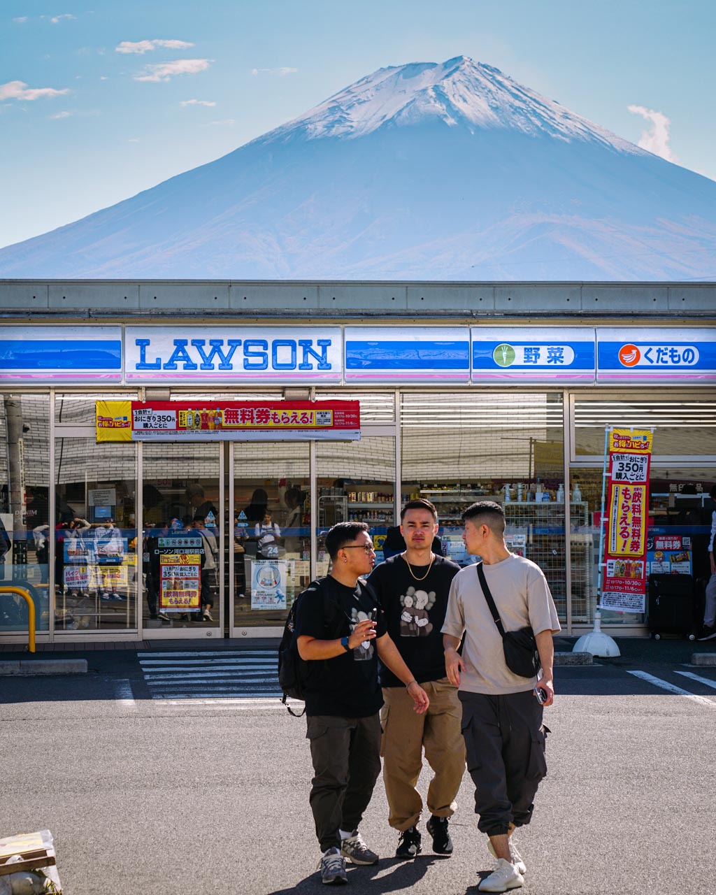
Fuji's LawsonFujikawaguchiko, JP
PeakedGrindelwald, CH
WotaingPhiladelphia, PA
New beginningsMalvern, PA
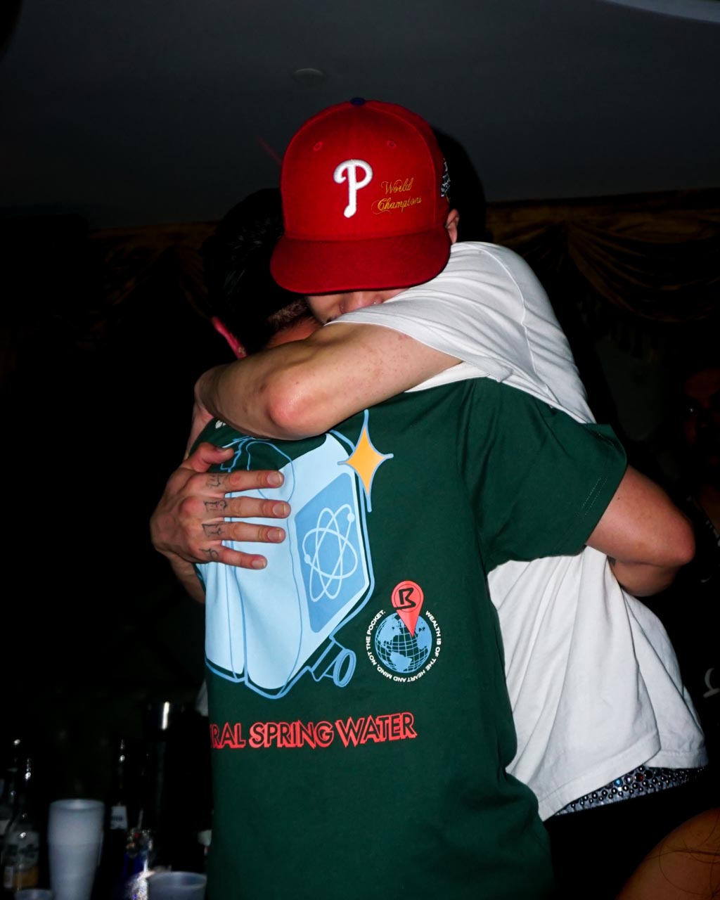
CongradsPhiladelphia, PA
NimbaePhiladelphia, PA
AlyshaMalvern, PA
LanternsKyoto, JP
Details matterMalvern, PA
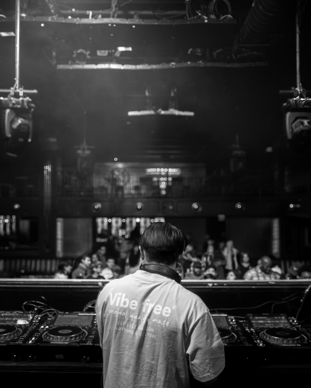
Behind the DJPhiladelphia, PA
PhillyPhiladelphia, PA
DNDPalm Springs, CA
See yaPhiladelphia,PA
Extra icingPhiladelphia, PA
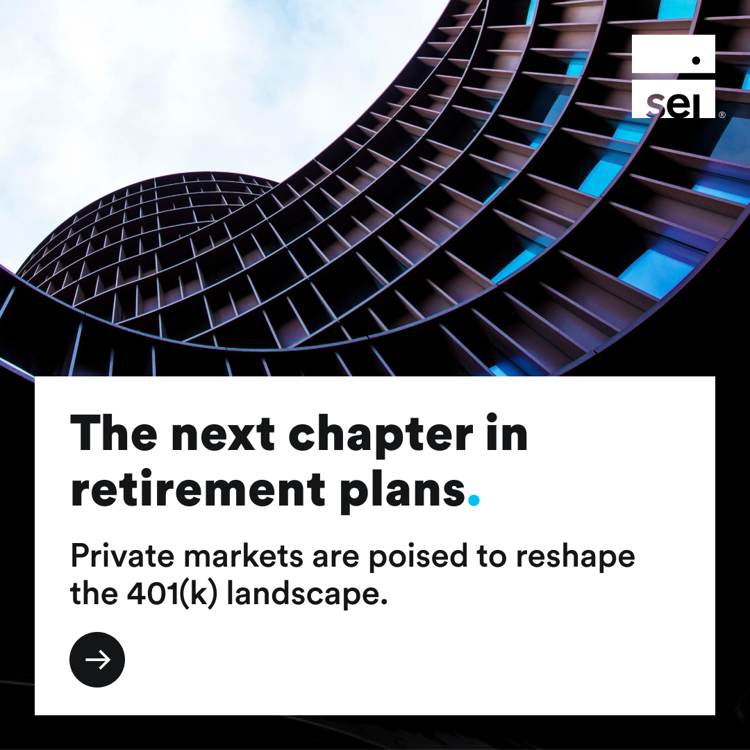
SEI Investments · UX Strategy & Design · 6 months
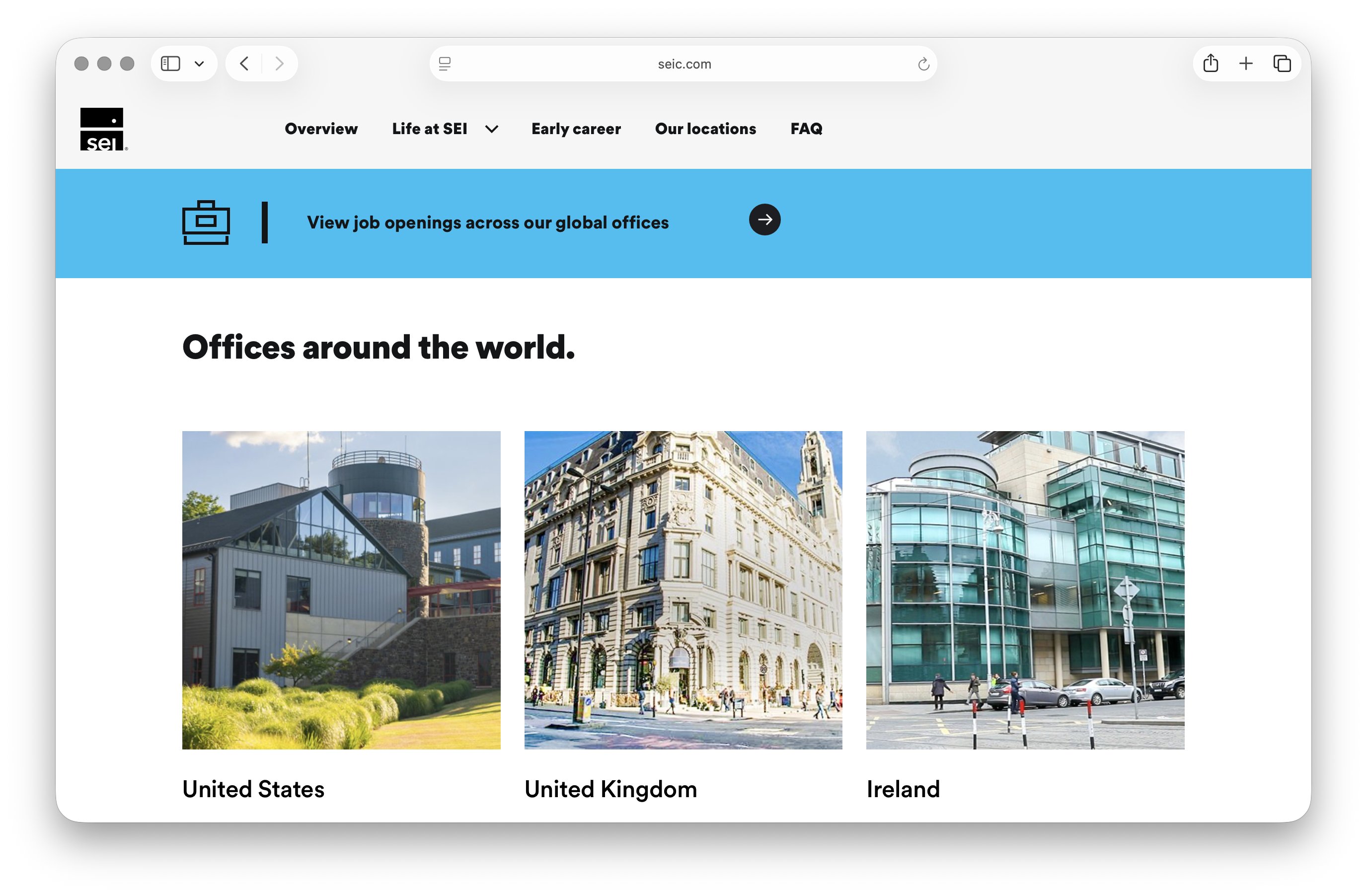
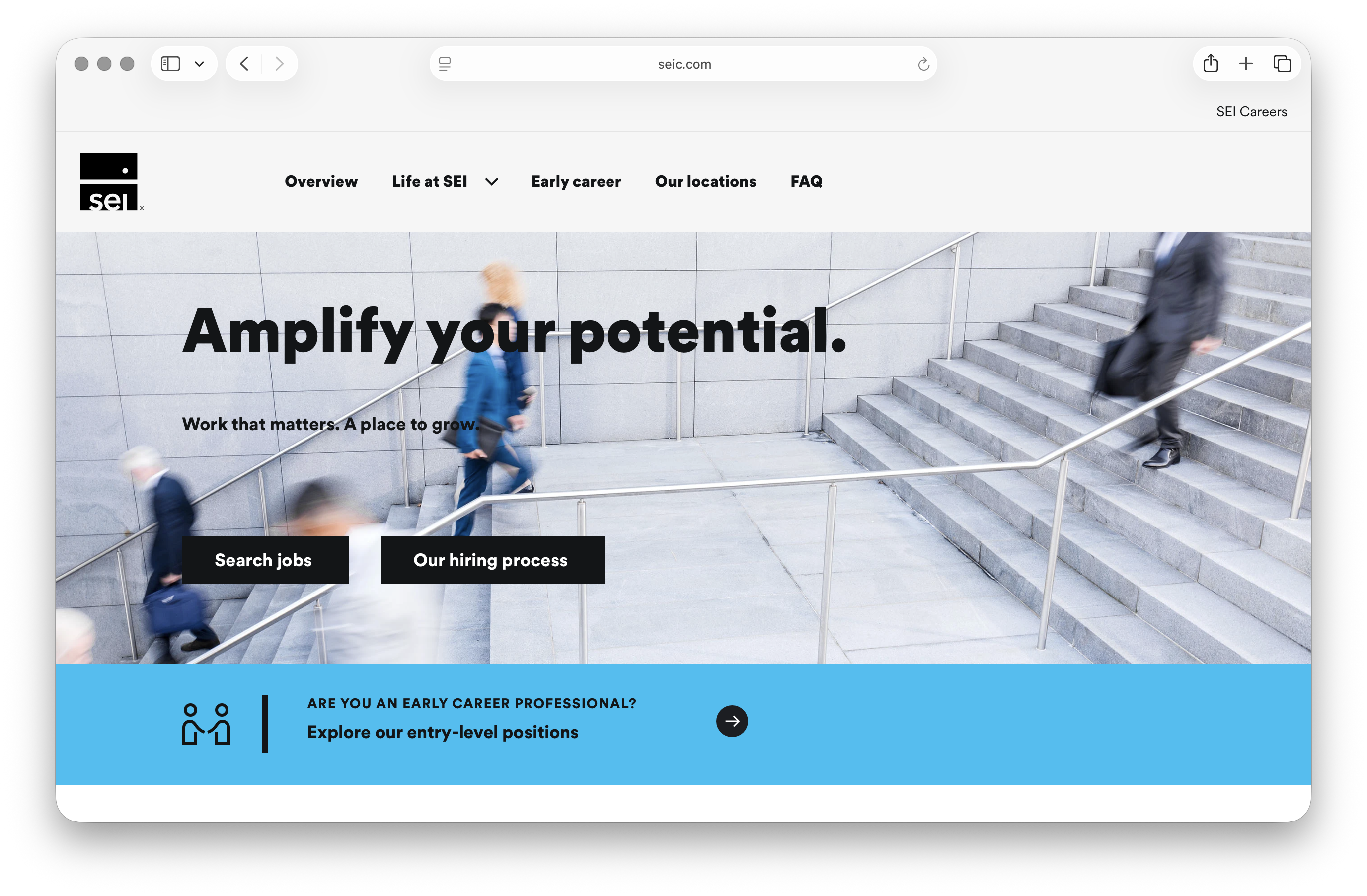
Global Careers Site
Leading the UX transition of a retiring third-party careers platform onto SEI's global marketing site — preserving three countries' worth of content while creating a seamless handoff to Workday.
Role
UX Lead
Timeline
6 months
Platform
Lucidmap, Figma, Drupal
Company
SEI Investments
The problem
The existing third-party careers platform was being retired. The task: migrate all careers content to SEI's global marketing site — without the ability to host job listings directly. The destination site also couldn't replicate the original's three-country structure, creating a significant information architecture challenge.
Why it mattered
The careers site is the first touchpoint for prospective employees. Getting the transition wrong meant losing candidates before they even reached an application. The experience needed to educate visitors about SEI and then guide them seamlessly to Workday to apply — with no friction, no dead ends.
My role
As UX lead, I owned the audit of the current site — determining what content was still relevant and what needed updating before the transition. I also rebuilt the site map to maintain the spirit of the three-country structure on a global scale. I collaborated with project management, content owners, copywriters, and the Talent Acquisition and People & Culture teams throughout.
This was also the project where I built my first end-to-end AI-assisted workflow — using Claude and ChatGPT across every stage: getting up to speed on the industry landscape, running competitive benchmarking across multi-region careers sites, generating placeholder copy, testing for friction, and modifying employee photographs for compliance.
Approach
Conducted a competitive landscape review of top financial industry peers — benchmarking multi-region careers sites using a structured AI-assisted framework to identify patterns in architecture, content, and candidate flow.
Audited all existing content for relevance, flagging what needed updating before migration.
Rebuilt the site map to embrace the three-country structure within a global architecture.
Phase 2 testing: Talent Acquisition and People & Culture stakeholders validated content accuracy and candidate experience.
On using AI
"The benchmarking was structured around 8 prompts I developed through my professional certificate program. AI didn't make the decisions — it made sure I was informed enough to make better ones."
Solution
A reimagined careers section on seic.com that educates visitors about SEI as an employer, then creates a clear, intentional transition to Workday for all job-related actions. The global site map resolved the three-country challenge by embracing a unified structure with regional nuance built in.
Impact
User experience
Seamless transition from the marketing site to Workday, preserving the candidate journey with no dead ends or confusing handoffs.
Stakeholder validation
Successfully signed off by both the internal technical team and the Talent Acquisition & People & Culture stakeholders through two phases of structured testing.
SEI Investments · Design Systems · Ongoing
Social Media Visual System
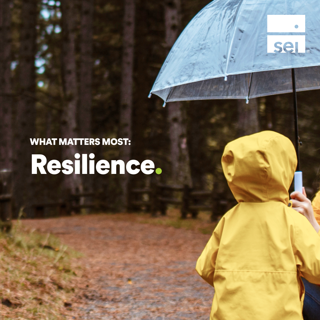
Establishing design systems and guidelines for a global company's social media presence — so every post, across every market, feels distinctly SEI.
Role
UX Strategist & Designer
Timeline
Ongoing (annual iteration)
Platform
Figma, LinkedIn
Company
SEI Investments
The problem
Creatives across SEI's business markets and segments were inconsistent — different teams producing assets with no shared visual language. The company needed a stronger, more distinguishable brand presence on social channels, particularly LinkedIn, without stripping each market of its core messaging.
Why it mattered
Inconsistency at scale erodes brand trust. Helping designers stay on-brand while creating assets that genuinely serve each segment's audience was both a creative and a business-critical challenge.
My role
I own the social media visual templates that live inside Figma, used daily by an in-house team of ~5 core designers. My contributions spanned auditing current templates, competitive landscape research, recommending solutions, implementing in workflow, and communicating directly with the core users of the system.
Approach
Reviewed past campaigns to analyze which performed best and worst, then identified the visual narrative connecting the high performers.
Conducted competitive analysis of fintech companies and how they treat different content types across social.
A/B tested design elements within LinkedIn to inform template decisions with real engagement data.
Consulted the analytics owner and the inner UX team for feedback loops throughout the process.
Key insight
"Segments appeal more to distinct and bold design."
Solution
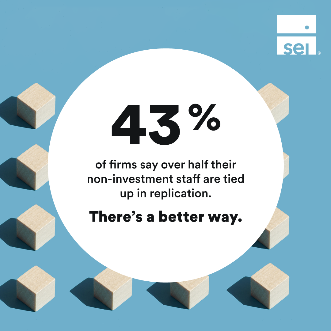
A visual template overhaul focused on clarity and boldness. Key updates included:
Introduction of a new "statistic" template to elevate meaningful numbers that resonate across markets.
Revamped headshot post treatments to drive more engagement and sign-ups.
Re-introduction of in-graphic CTA buttons to drive interaction directly from the post.
Carousel treatments strongly encouraged across all content types.
All foundational branding elements preserved and carried over for consistency.
Impact
Conversion
4 immediate website conversions directly attributed to the newly designed carousel posts.
Internal adoption
Templates actively used by ~5 core designers across the in-house team, standardizing the creative workflow at scale.
SEI Investments · UX & UI Design · 7 months
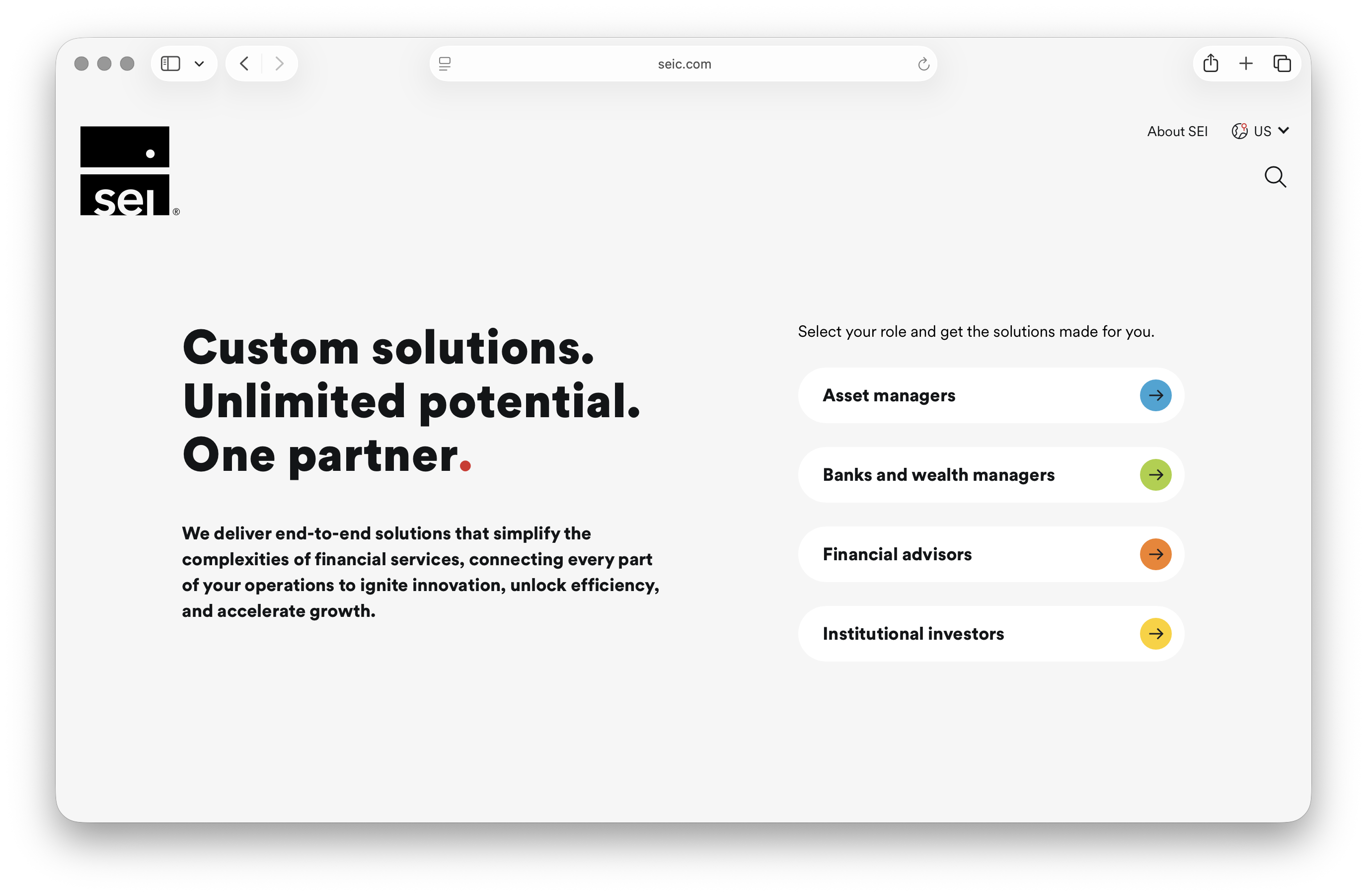
Homepage self-identifiers
Restructuring and reimagining seic.com's homepage with an audience-centric focus — so visitors could self-identify and immediately reach content relevant to them.
Role
UX & UI Designer
Timeline
7 months
Platform
Figma, Drupal
Company
SEI Investments
The problem
Visitors were getting lost within seic.com and unsure which content was relevant to them. Because SEI serves multiple audience segments with different needs — institutional investors, financial advisors, private wealth clients — the homepage offered no clear entry point. The result was high abandonment and a confusing user journey across segments.
Why it mattered
Without a way to self-identify, visitors were left to navigate a site designed for many but optimized for none. The business needed a way to drive engagement and generate qualified leads — and that started at the front door.
My role
I assisted in executing the heuristic test and surveyed 40 individuals with 3 homepage options. Working alongside a UX strategist, analytics team, and frontend and backend developers, I led the wireframing and UI design, including the creation of a brand-new component: the audience selector pills.
Audience selector pills
Select your role and get the solutions made for you.
Conducted a usability test revealing that visitors abandoned the current journey because they didn't know where to click.
Performed competitive analysis of industry peers to identify patterns in audience-first navigation and self-identifier selection.
Surveyed 40 users across 3 homepage concepts to validate direction before committing to design.
Wireframed the homepage in Figma with audience-first positioning as the core principle, reducing friction for every possible journey.
Designed the pill-shaped audience selector buttons in the hero banner — a brand new component for the company.
Solution
A simplified, decluttered homepage anchored by audience selector pills. Visitors are prompted to self-identify at entry, then guided to their relevant content section — with their selection persisting via an audience dropdown throughout their entire site experience, confirming they're always in the right place.
Key insight
"People resonate with familiarity and what benefits them first. Seeing their role in an industry of many roles confirms they're in the right place."
Impact
User behavior
Users overwhelmingly preferred the ease of selecting their role from the audience selector. Visitors tracked to have longer sessions once inside their relevant audience section.
Site metrics
While overall traffic to the site reduced in the 21 days post-launch, visitors stayed on the site for a longer duration — a signal of higher content relevance and engagement quality.
About
I started college studying biology - pre-dental track, the whole thing. Then I took a design class on a whim and something clicked that hadn't clicked before. I switched paths, which felt risky at the time and obvious in hindsight. Turns out studying living systems and designing digital ones aren't that different: both are about understanding how things connect, where friction lives, and what it takes to make something feel effortless.
Now I'm a UX designer working in fintech and operations, the kind of design that has to earn trust fast and never get in the way. I care a lot about craft, and maybe a little too much about getting the details right.
Off the clock, I'm somewhere with a camera and probably a bowl of something warm. Photography taught me to slow down and actually look - which, it turns out, makes me a better designer too.